HAYASHI
THE ENGINEERING OF PERCEPTION
MONTERREY, MEXICO | 2025
HAYASHI COMPANY
SPATIAL + DIGITAL EXPERIENCE DESIGN
STATUS: IMPLEMENTATION
It wasn't just a logo change; it was a cultural restructuring of a firm where technical logic had long dominated over user experience. By reframing design as a strategic system, I transformed "The Engineering of Perception."
The Challenge: Overcoming Technical Inertia
The challenge at Hayashi was an exercise in change management. I stepped into a purely technical organizational culture where design was perceived as an ornament rather than a strategic asset.
Resistance to Change: The engineering team viewed brand unification as a distraction from technical complexity. My role was to demonstrate that visual incoherence was, in fact, an operational inefficiency.
The Golden Ratio Dilemma: The company had a strict mandate: the logo must incorporate the Fibonacci sequence. However, the existing implementation was literal and forced, undermining the brand’s professionalism and perceived modernity when presented to enterprise clients like Siemens and P&G.
The Strategy: Fibonacci as an Invisible Backbone
To resolve the internal resistance and the structural issues of the logo, I shifted the conversation from "aesthetics" to "systems."
1. From Illustration to Structure
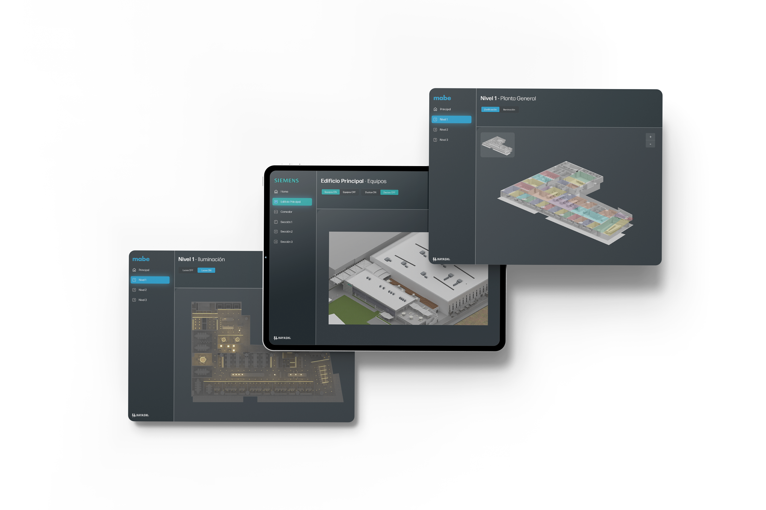
Instead of drawing an obvious spiral over a graphic, I utilized the Fibonacci sequence as the mathematical compass for the entire brand identity. The grid wasn't meant to be seen; it was meant to be felt through the balance of whitespace, typographic proportions, and dashboard margins.
The Result: A brand that projects engineering precision without being literal. Sacred geometry evolved from a decorative graphic into the source code of our visual communication.
2. Design for Non-Designers
To gain the technical team's trust, I implemented the strategic architecture as an "assembly manual."
Implementation: I developed UX models and style guides that spoke the language of engineers. By standardizing deliverables, I eliminated ambiguity in the workflow.
The Impact: Technical teams achieved autonomy in maintaining consistency, drastically reducing cognitive friction between departments and with the end client.